
Why Your Marketing Materials Look Inconsistent (And How To Fix It)
Why one-off files always drift
When every brochure, deck and social post is designed in isolation, small decisions pile up. A slightly different blue here, a different heading size there, and within a year your material looks like it came from several different companies. The problem is not any single file, it is the absence of shared rules underneath them.
A system, not a stack of files
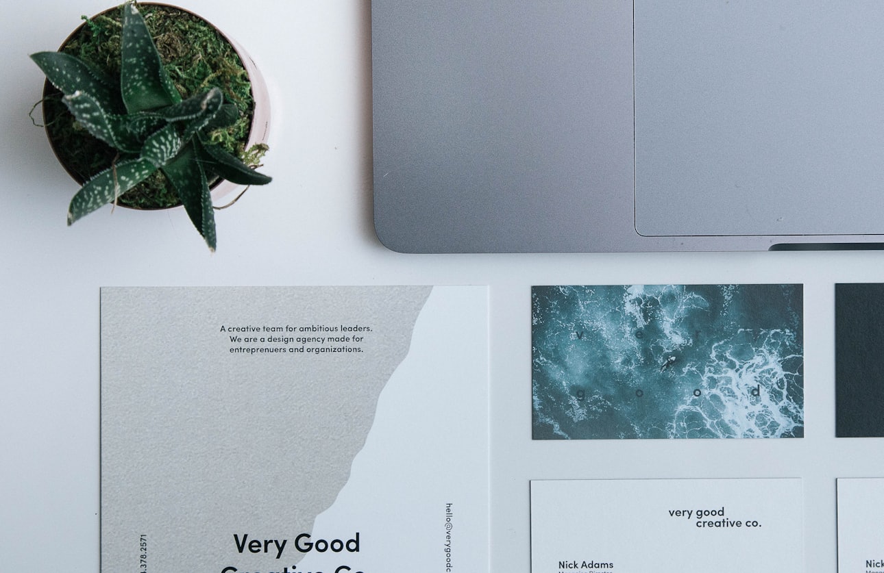
The fix is to define the foundations once: grids, type scales, colour rules and image treatment that every piece is built from. Work from that system and each new item is visibly part of the same family without anyone having to police it. On-brand becomes the easy default rather than something you enforce piece by piece.
Templates put speed in your team's hands
Most businesses do not need a designer for the material they produce every week. Editable templates for your recurring pieces let your own team turn routine work around in minutes rather than paying a design fee each time, while the underlying system keeps the output consistent. That is where a design system pays for itself.
Getting print right the first time
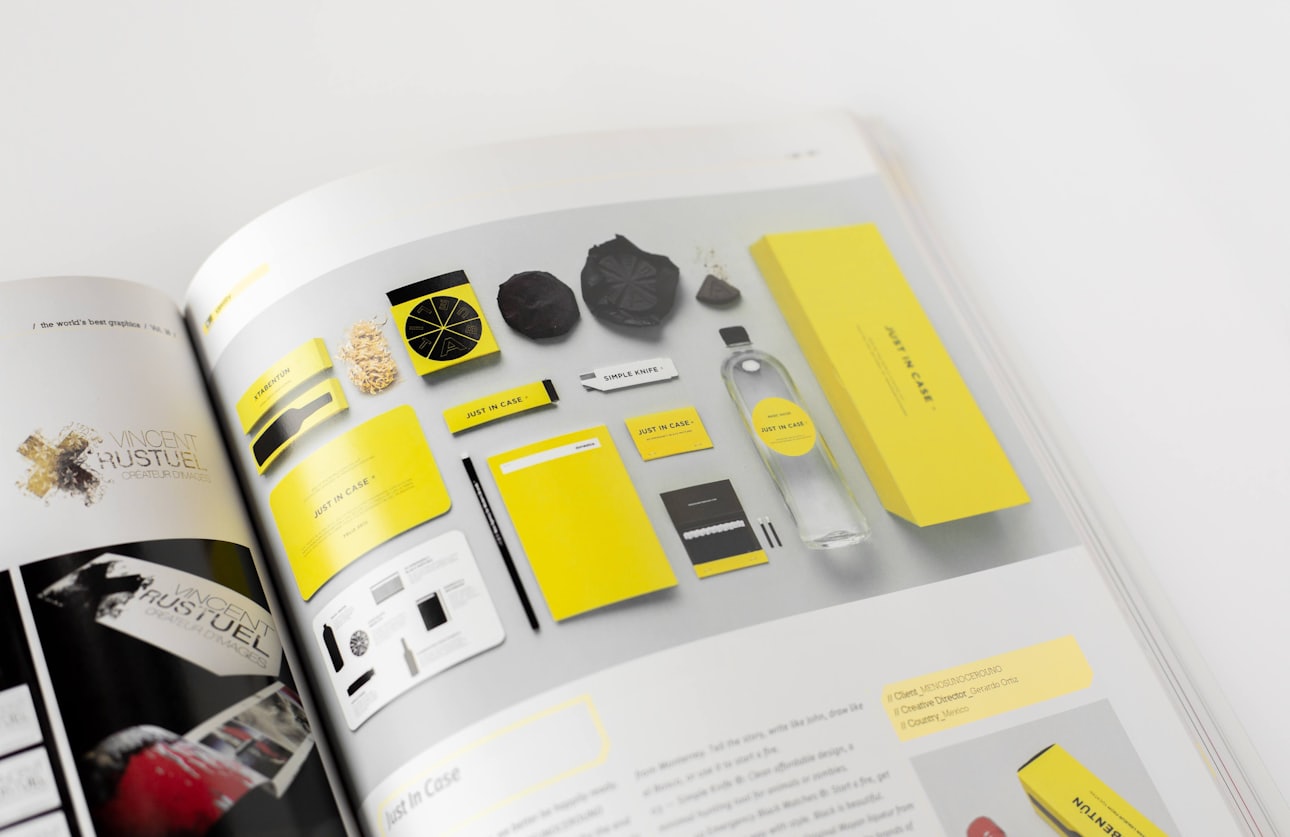
Screen and print are not the same discipline, and the difference shows up as colour shifts and reprint bills. We prepare press-ready artwork to your printer's specification, with correct colour profiles, bleed and resolution, and check it before it goes to press. On screen, assets are optimised so pages stay quick to load.
Questions On This Topic
Short answers to what readers ask
Related Reading
All articles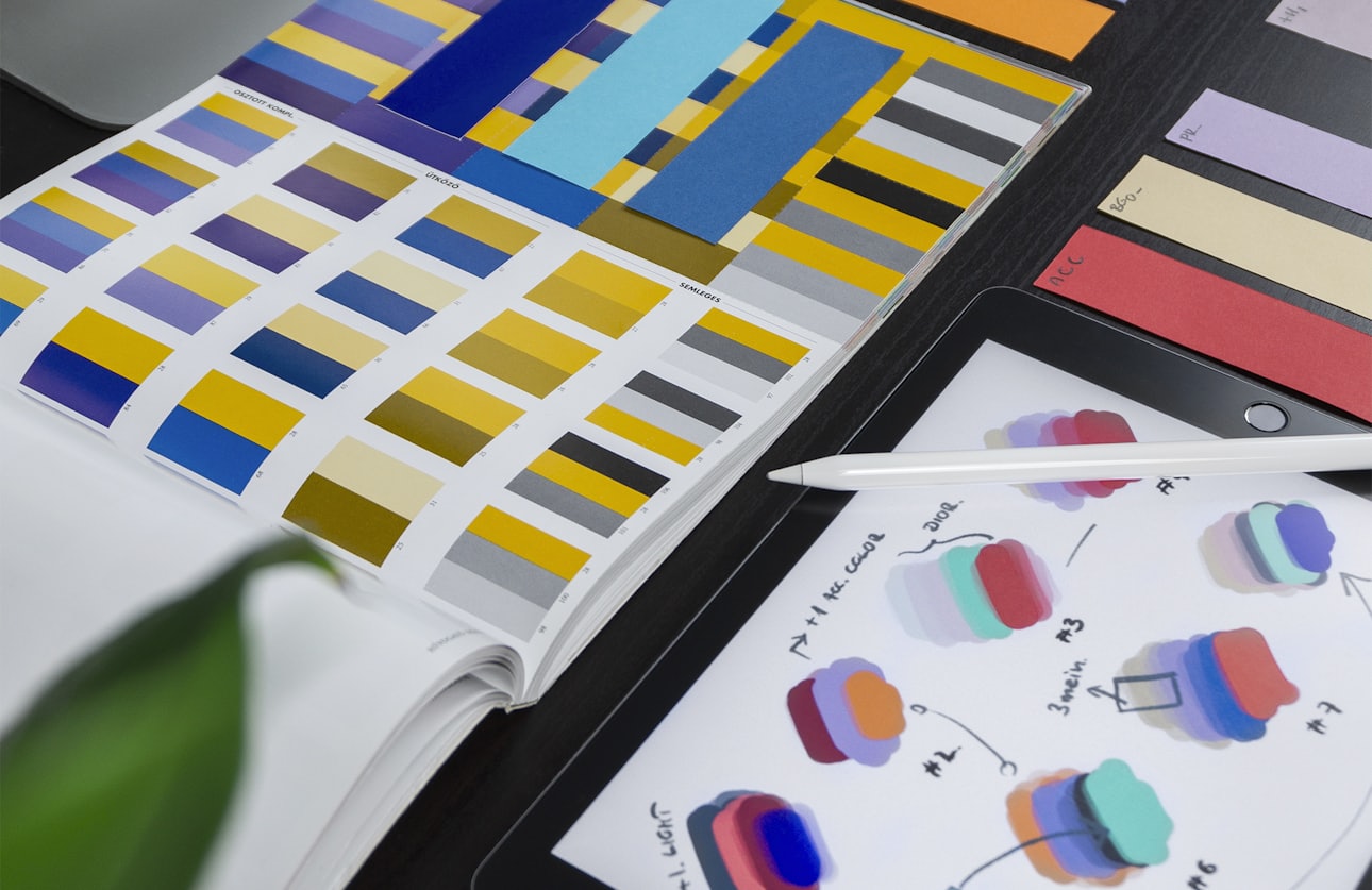
A logo can look superb on a presentation slide and fall apart the moment it hits a browser tab or an embroidered shirt. Here is how to judge whether yours genuinely holds up.
A beautiful guidelines PDF that sits unopened is not a brand system, it is an expense. The difference is documentation built around how people actually work.
Free consultation - find the right build for your business
Tell us what you're trying to achieve and we'll tell you what it takes. We review your current site, your market and your goals, then recommend a route — a new website, an online store, or an SEO programme — with clear scope and pricing before you commit.